|
Copyrighted Material -CLICK for information |
|
Back |
|
|
Coles Phillips
(1880 - 1927) Coles Phillips and the |
|
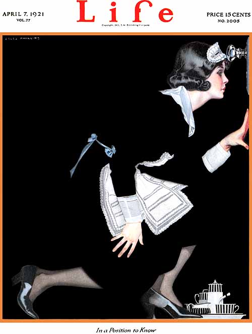
Life, "In A Position To Know" (1921) Phillips,C - 001
|
|
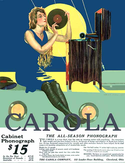
Carola, "The All-Season Phonograph" (1916) Phillips,C - 002
|
|
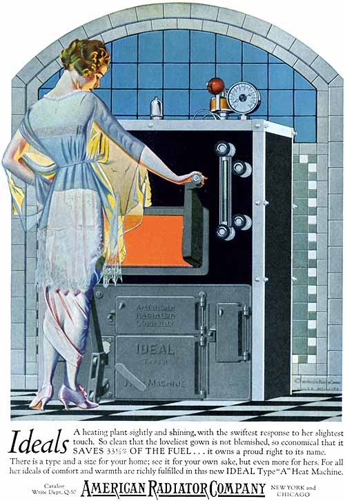
American Radiator (1921) Phillips,C - 003
|
|
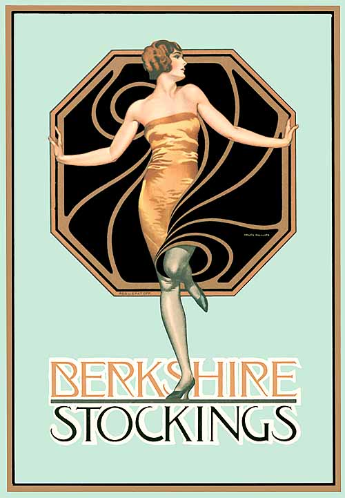
Berkshire Stockings (year) Phillips,C - 004
|
|
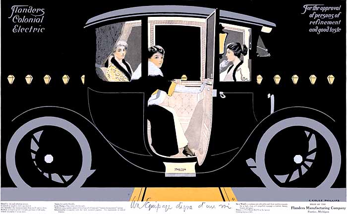
Flanders Colonial Electric (1912) Phillips,C - 005
|
|
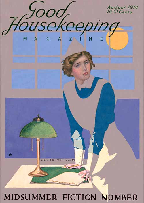
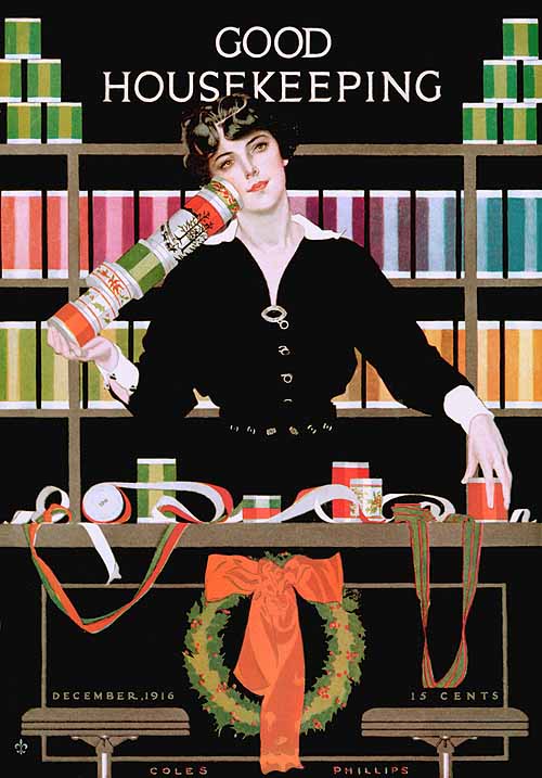
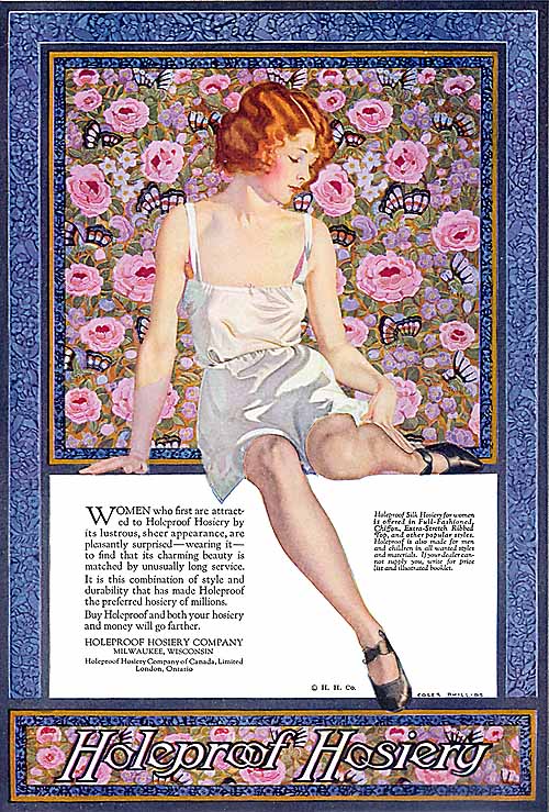
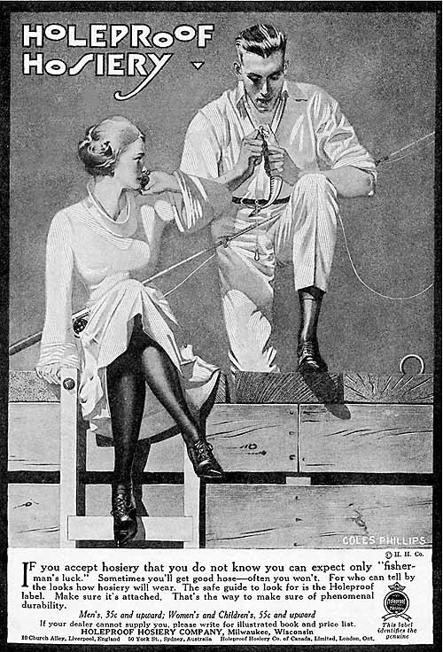
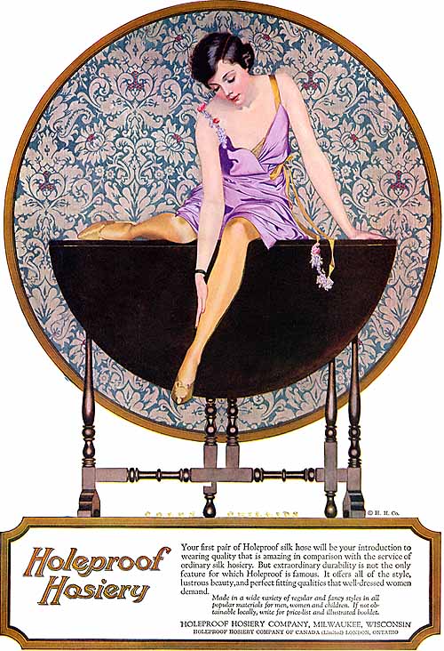
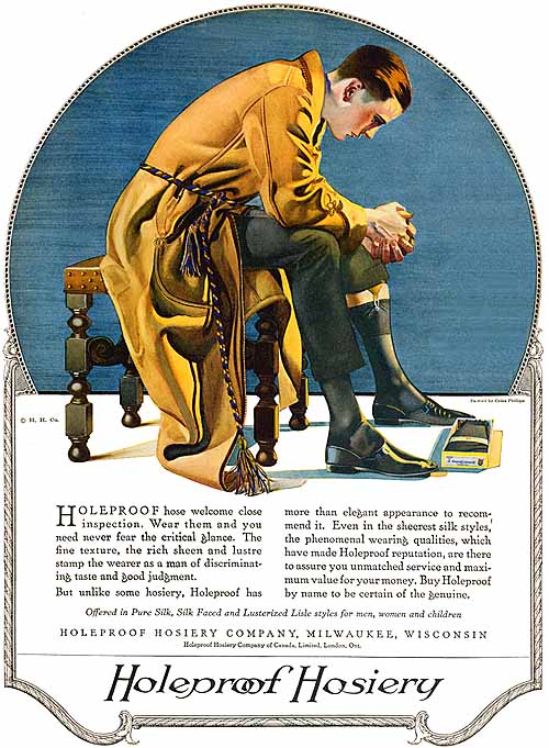
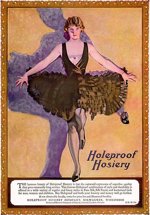
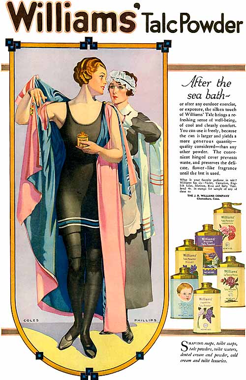
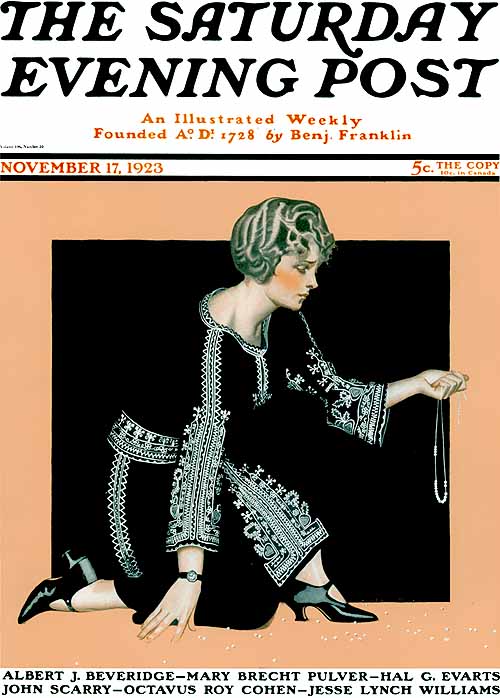
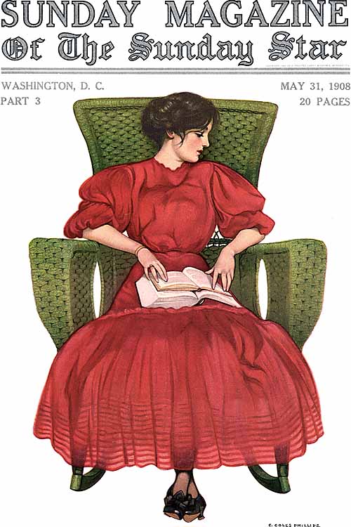
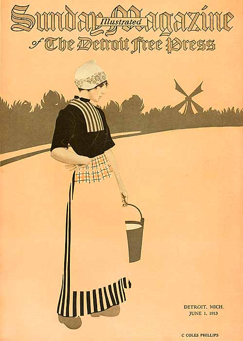
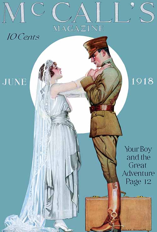
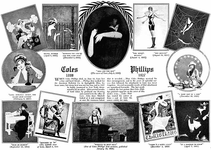
The first two decades of the 1900's saw dramatic changes in how artists portrayed American women in magazines and other media. Instead of the prim, proper, and idealized "Gibson girl" socialite of the 1890's, the public was treated to an outpouring of more modern, active, and athletic images of women. Chief among the early architects of this "Golden Age of American Illustration" was Coles Phillips, popularizer of the "fade-away" style, and one of the first artists whose images of ladies were frequently torn out of magazines and swiped out of store windows to become pin-ups on college dormitory walls. Phillips was born in Springfield, Ohio, in 1880, and attended Kenyon College (where some of his earliest illustrations appeared in the school's yearbook) while working as a clerk for the American Radiator Company. He moved to New York before graduating, however, and briefly took night classes at the Chase School of Art while working in the New York office of the radiator company. With little interest in clerical work, he soon moved to a studio that produced advertising illustrations on an "assembly-line" basis, with one worker doing the heads and passing the picture down to the next, who supplied the suit; Phillips did the feet, and his talent in drawing a shapely ankle was frequently put to use, in the years to come, in the many elegant hosiery ads he produced. |
|
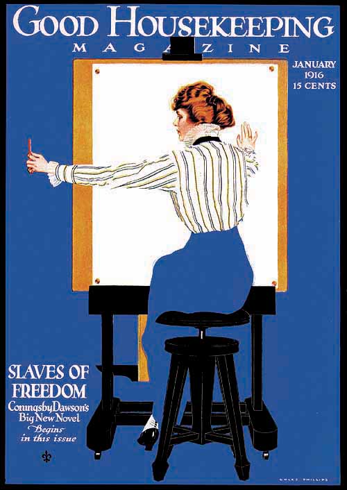
Good Housekeeping (1916) Phillips,C - 006
|
|
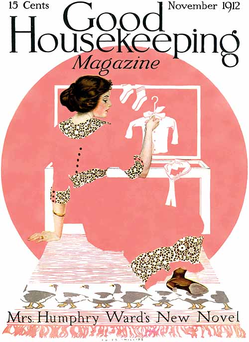
Good Housekeeping (1912) Phillips,C - 007
|
|
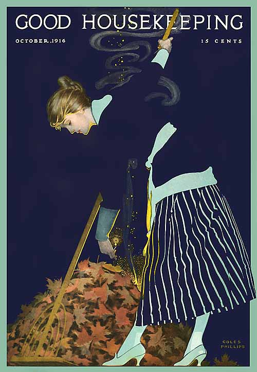
Good Housekeeping (1916) Phillips,C - 008
|
|
Good Housekeeping (1914) Phillips,C - 009
|
|
Good Housekeeping (1916) Phillips,C - 010
|
|
Phillips moved briefly to an advertising agency, staying there just long enough to learn the business and open his own "C. C. Phillips & Co. Agency" in 1906, employing two other artists. This business was reasonably successful, but dealing with clients left Phillips with too little time and energy for his own artwork, and he made the leap to free-lance illustrator. He rented a studio by promising the landlord that he could pay the rent, at the end of the month, by selling the illustrations he would do. Having made a careful study of the early humor magazine called "Life" (not to be confused with the later, photographic magazine of the same name), Phillips was confident he could submit work that would be accepted there, and it was. His first nationally published illustration was a Life black-and-white centerfold, published Apr. 11, 1907, contrasting a beautiful young lady with an elderly woman who had seen better days, captioned with lines from Omar Khayam's Rubiyat. |
|
Holeproof Hosiery (1924) Phillips,C - 011
|
|
Holeproof Hosiery (19??) Phillips,C - 012
|
|
Holeproof Hosiery (1924) Phillips,C - 013
|
|
Holeproof Hosiery (1920) Phillips,C - 014
|
|
Holeproof Hosiery (1923) Phillips,C - 015
|
|
Over the following winter, Phillips supplied several more of these black-and-white cartoons for Life, which were often run as centerfolds (as Gibson's had been) and always captioned with a wry humor. Toward spring, the editors of Life decided to move consistently to color covers, in hopes they could attract more attention on the newsstands. Phillips was asked whether he could supply something new and distinctive, something that would help the magazine build a new image, and he knew just the trick -- the fade-away.
|
|
Williams' TalcPowder (1919) Phillips,C - 016
|
|
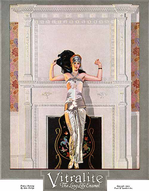
Vitralite (1924) Phillips,C - 017
|
|
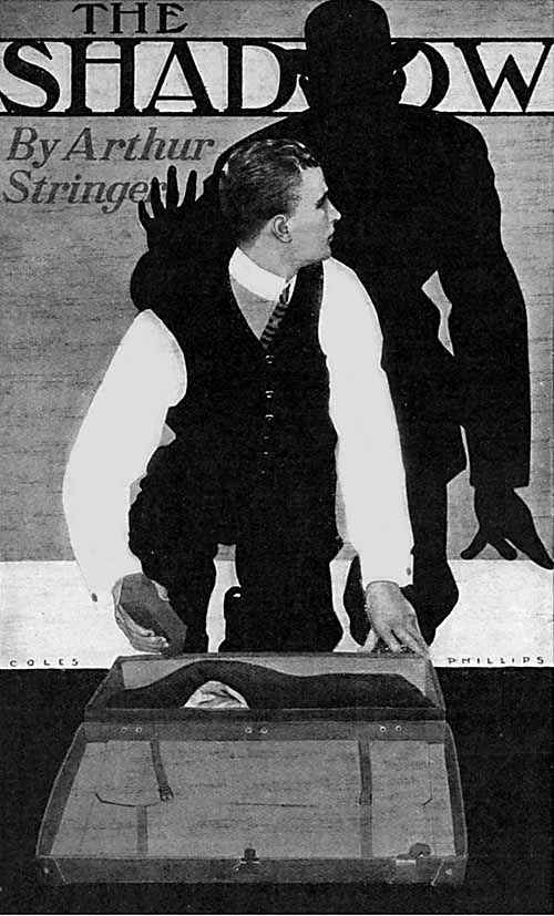
Century Magazine, "The Shadow" (1913) Phillips,C - 018
|
|
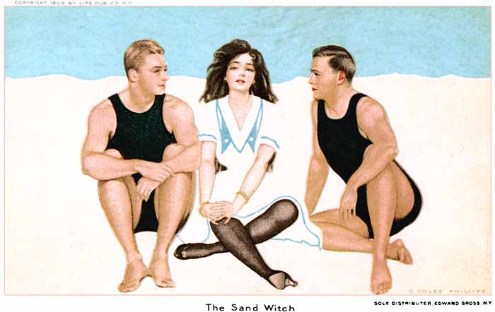
The Sand Witch (1909) Phillips,C - 019
NOTE: this postcard is based on a 1909 Life cover
|
|
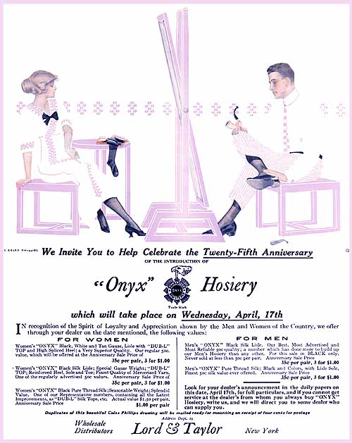
Onyx Hosiery (1912) Phillips,C - 020
|
|
Palmolive Soap (1920) Phillips,C - 021
|
| The idea had first occurred to him during his ad agency days, when he was visiting a friend who was wearing a tuxedo and playing a violin in a very dimly lit room. Phillips noticed that even though he could see little of the man, his friend's complete figure was suggested by just the highlights on the violin, the shine on his shoes, and the small bits of white shirt that were visible. Phillips had used the technique in black and white ads, and decided to see if he could make it work in color as well. Within a couple weeks, he had a painting ready to show the editors, depicting a young girl in a polka-dot dress, feeding corn to a flock of chickens. Of the lady, only her face, arms, and feet were painted, with the rest of her figure and clothing suggested only by the arrangement of the polka-dots; of the chickens, only their heads, wings, and feet are visible, with the viewer's mind supplying the white feathers and the lady's white dress. |
|
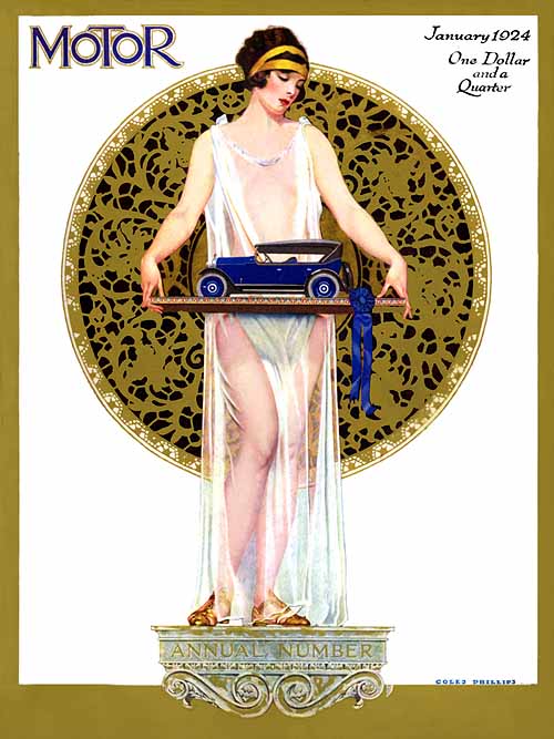
Motor Annual (1924) Phillips,C - 022
|
|
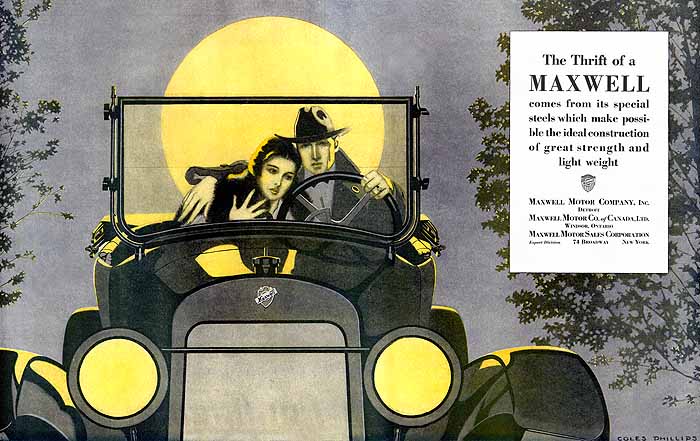
Maxwell (1920) Phillips,C - 023
|
|
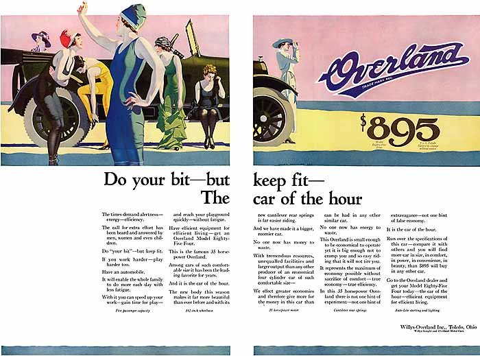
Willys Overland (1917) Phillips,C - 024
|
|
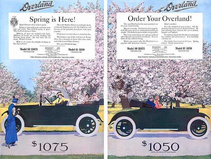
Willys Overland (1915) Phillips,C - 025
|
|
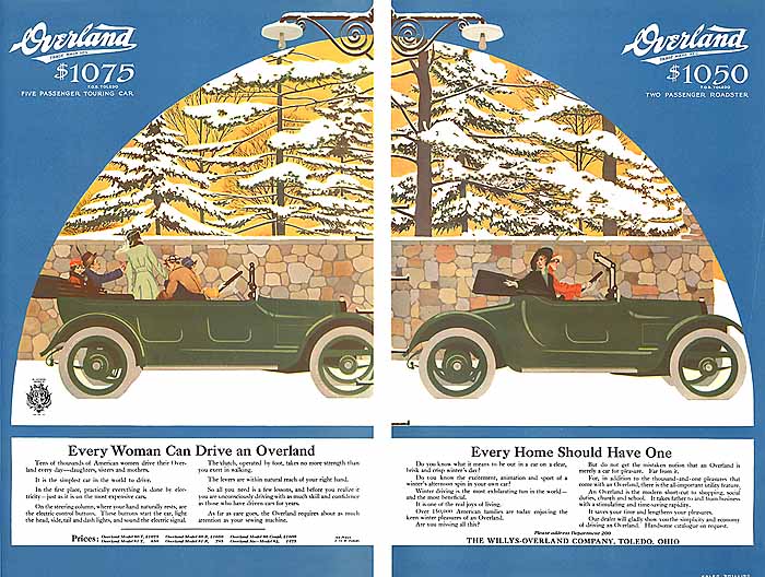
Willys Overland (1915) Phillips,C - 026
|
|
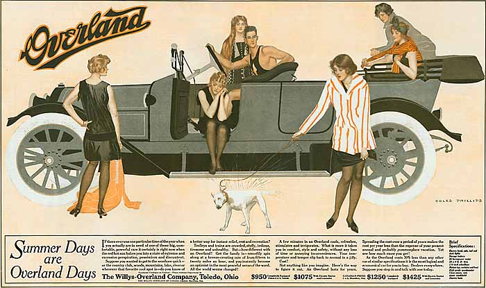
Willys Overland (1912) Phillips,C - 027
|
|
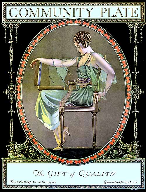
Community Plate (1919) Phillips,C - 028
|
|
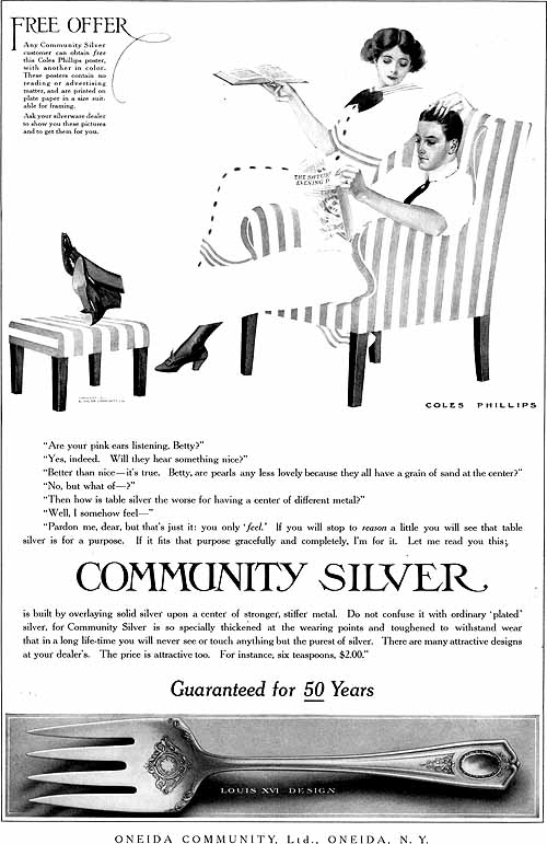
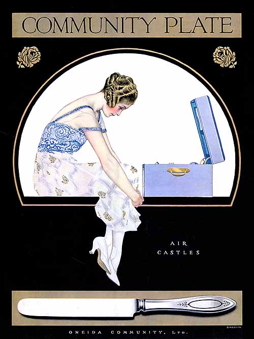
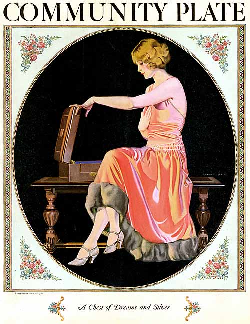
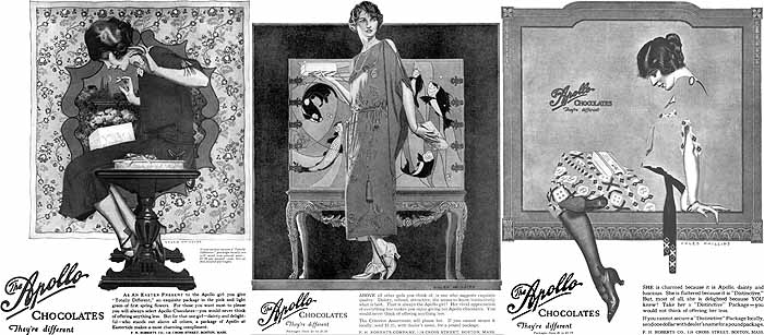
Phillips' first cover appeared on the Life issue for Feb. 20, 1908, and was such a success that he supplied no fewer than 54 cover paintings for Life over the next four years. He then signed a contract with Good Housekeeping, agreeing to paint a cover image for that magazine every month for five years! The Life and Good Housekeeping covers made Phillips world-famous, and he was greatly in demand to supply paintings for advertisements as well. Although some other cover artists of his day had qualms about doing such commercial work, Phillips was a serious business person, and argued that he could little difference between painting for the front cover of a magazine, and painting for the ad that went on the back cover of the same issue! His longest associations were with automobile (Willy's Overland), silverware (Oneida Community), and hosiery (Holeproof and Luxite) manufacturers. Phillips was one of the first illustrators to insist that his name appear with all his images, including advertising work, and he usually painted a signature in print letters into each work.
|
|
Community Plate (1919) Phillips,C - 029
|
|
Community Plate (1911) Phillips,C - 030
|
|
Community Plate (1920) Phillips,C - 031
|
|
Community Plate (1924) Phillips,C - 032
|
|
Apollo Chocolates (1923) Phillips,C - 033
|
|
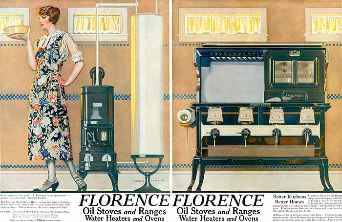
Florence Oil Stoves and Ranges (1923) Phillips,C - 034
|
|
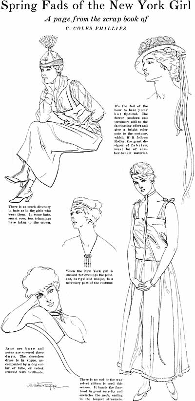
Woman's Home Companion, "Spring Fads..." (1915) Phillips,C - 035
|
|
Today, Phillips illustrations provide a fascinating collecting field, attractive both for their beauty and the variety of places where they appeared. There are Phillips magazine covers, illustrations, and ads, postcards, posters, poster stamps, prints, book illustrations, calendars, hosiery and silverware boxes, fans, blotters, streetcar signs, and booklets. Most Phillips items are relatively inexpensive, although that doesn't mean they're easy to find. Putting together a complete set of the 62 Good Housekeeping or 70 Life covers is likely to take most collectors at least a year or two. There are some more expensive items; both "A Gallery of Girls" and Phillips' other hardcover art collection, "A Young Man's Fancy," run several hundred dollars (especially if they can be found in their original boxes) and a rare World War I poster showing only a lovely deco-style light bulb has brought auction prices of over $5000!
|
|
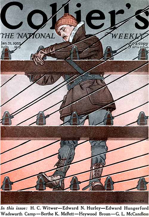
Collier's (1922) Phillips,C - 036
|
|
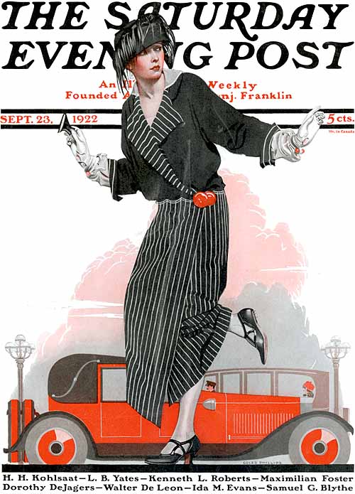
Saturday Evening Post (1922) Phillips,C - 037
|
|
Saturday Evening Post (1923) Phillips,C - 038
|
|
Sunday Magazine (1908) Phillips,C - 039
|
|
Sunday Magazine (1913) Phillips,C - 040
|
|
McCall's (1918) Phillips,C - 041
|
|
But perhaps the most interesting aspect of a Phillips collection is the opportunity to make new discoveries. Within the past few years, for example, his first known yardlong advertising print was found, as was an extraordinary store display for Edison Mazda lightbulbs, done in 1923, during the heyday of Maxfield Parrish's calendar work for that advertiser!
|
|
Life, Coles Phillips memorial, center spread (1927) Phillips,C - 042
|
